

A new Brand, for a brand new Scottish film production company, Cloud Break Pictures.
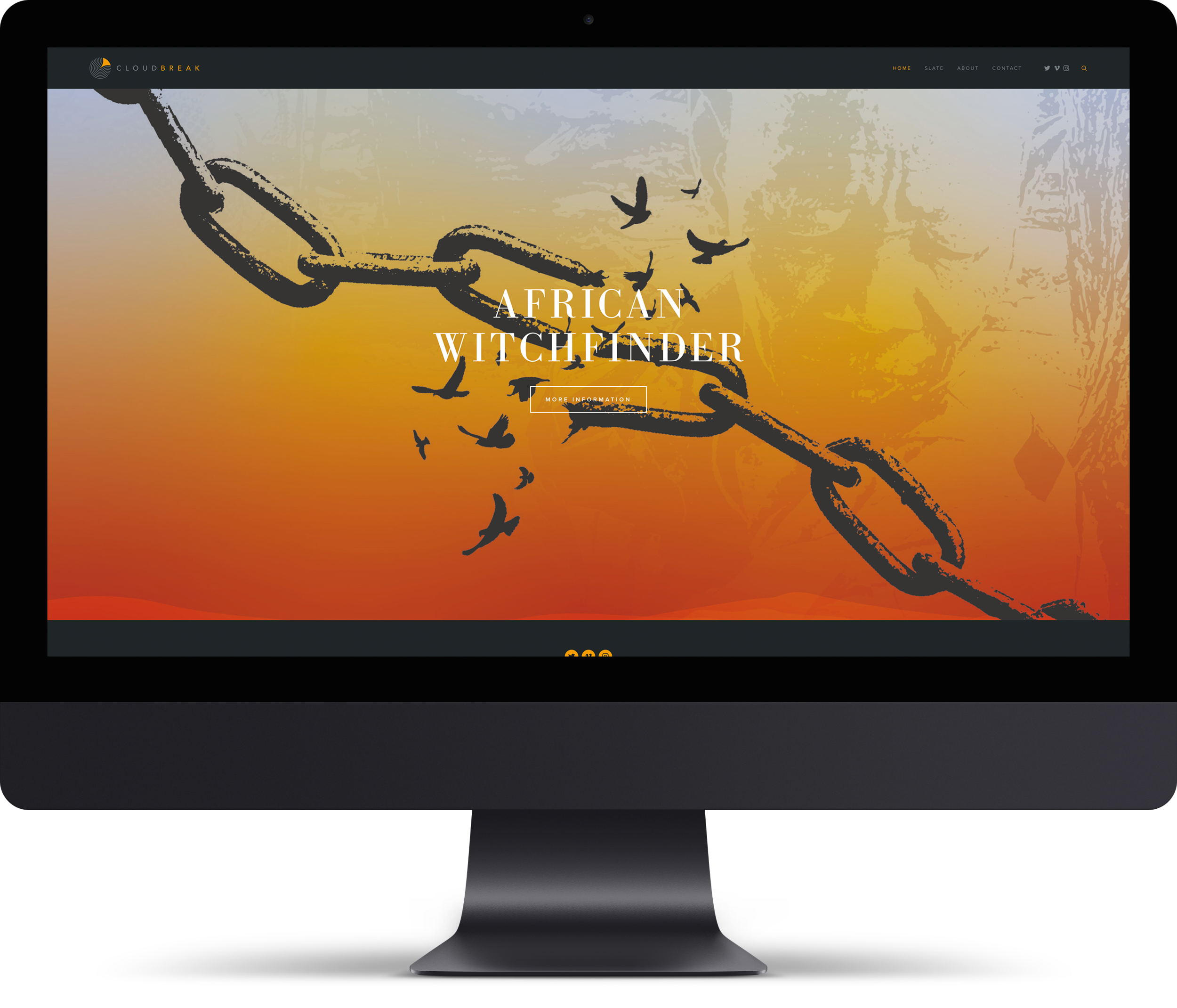
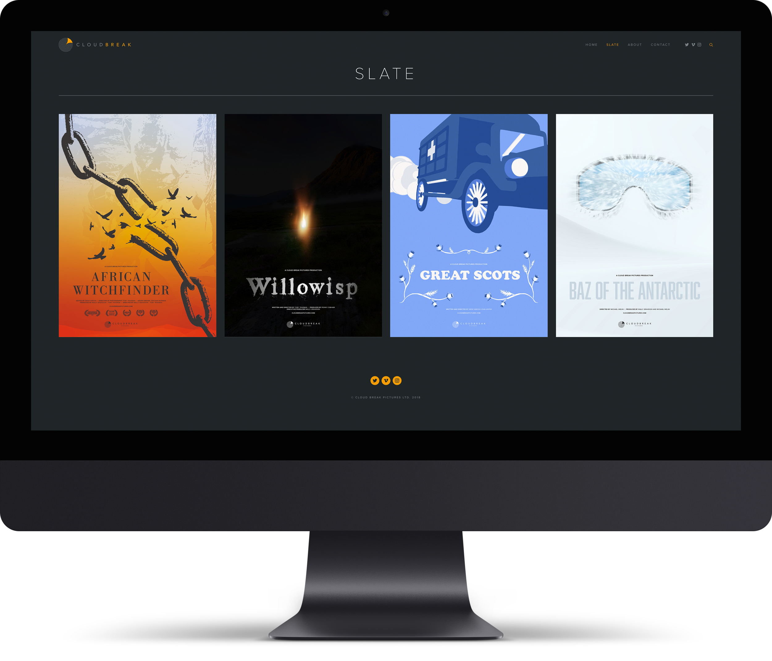
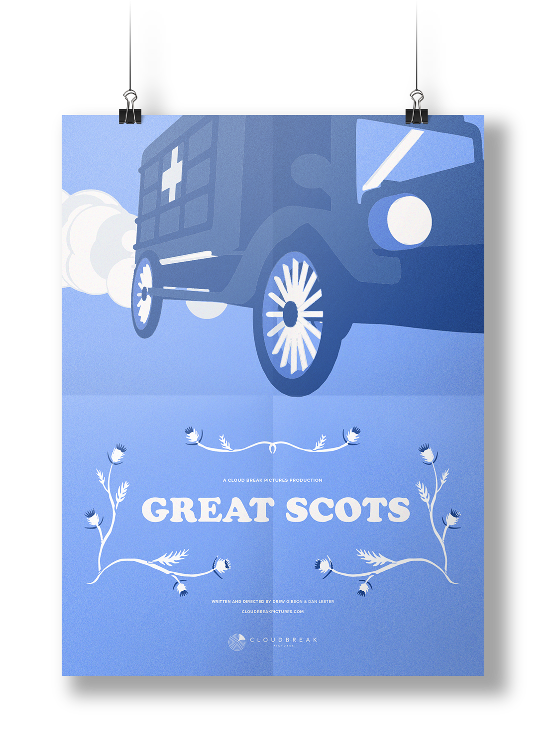
We were approached by Cloud Break Pictures to create a completely new brand, identity, and website for the launch of their new Scottish Film Company. From their social avatar, right through to the film posters displayed on their new website, everything was considered, designed and produced to the highest level.
Creating the brand identity.
the chosen marque


The Identity and website are looking ace, thanks for all your hard work! We showed it to the team this morning, and there was a wee round of applause. Everyone's really excited about it. It's always reassuring to see a website that makes us look Awesome!
Toby Truman, Director, Cloud Break Pictures
Behind the Iconography.
The icon was originally designed using geometric lines to create the initials “C” and “B” for Cloud Break. A final curve completing the circle was then added to create the sun shape breaking through the cloud. Finally the marque was cropped to create the distinctive Cloud Break icon.

A splash of colour.
A simple, sophisticated, pastel colour palette was chosen, representative of the glow from a warm evening sun, and the deep mysterious grays of the sunlight splitting the clouds.
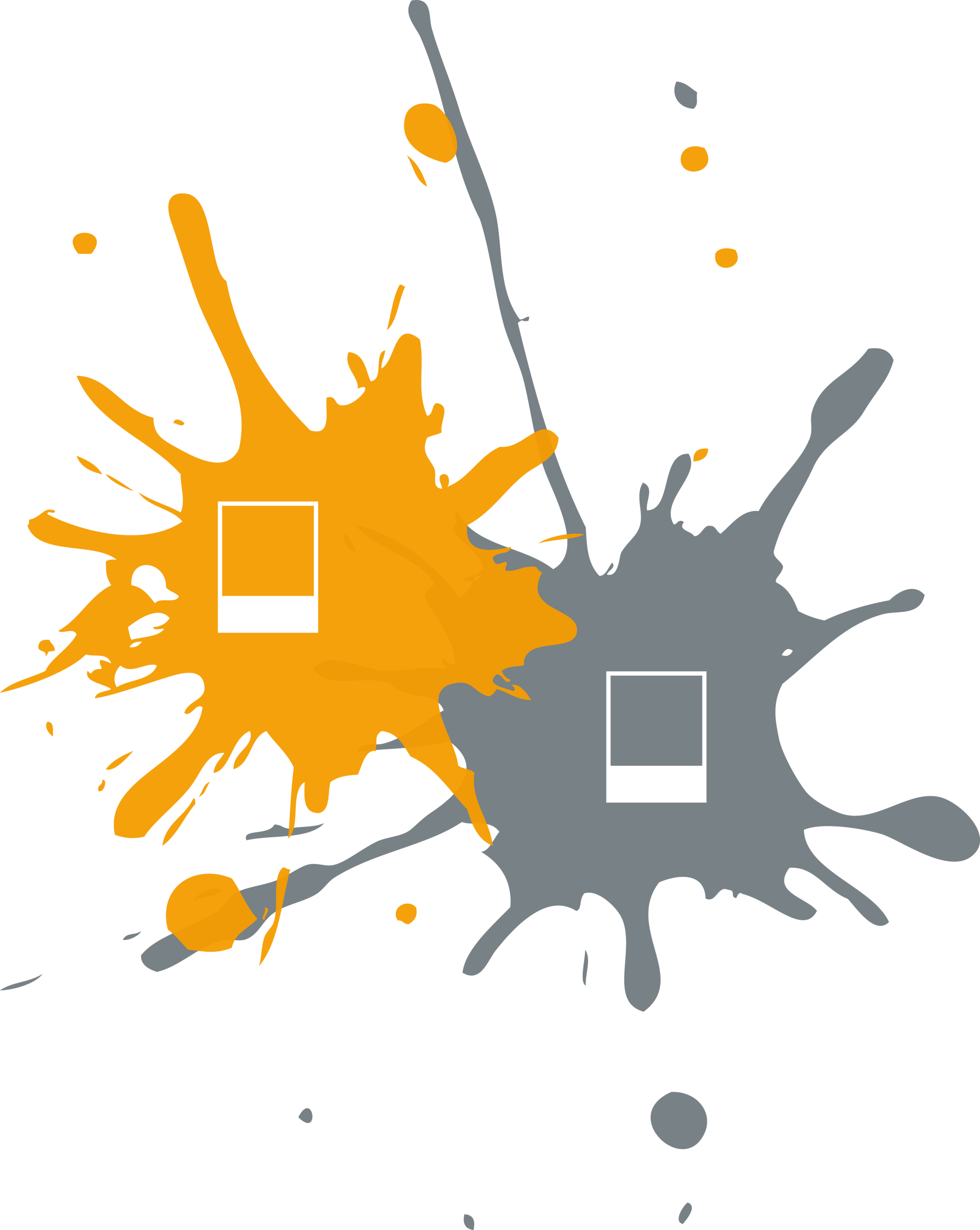
the iconography
The film posters.


The website.
visit: www.cloudbreakpictures.com